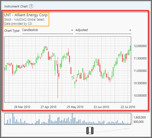
Instrument Chart Panel
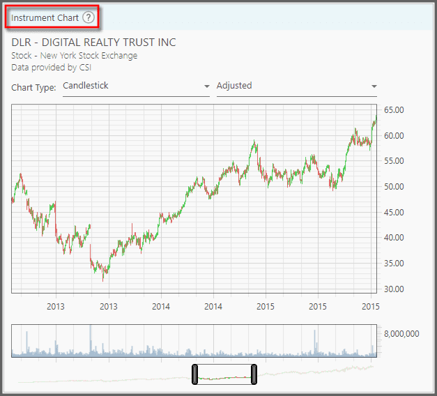
Located at the right area of the Portfolio Management page, this panel shows the Price and Volume Charts of an instrument. First you need to select an instrument (from the Portfolio Instruments Panel at the left) for this chart to show its contents.
1. The top chart is the Price Chart: it shows the price history for that instrument. At the top of this chart you can see the instrument's symbol, full name, the exchange it's trading at, and the source for the price data. The horizontal axis describes time, while the vertical axis is the dollar price (or value) for that instrument.
You can click and drag to pan around this chart. You can also zoom-in and out with the mouse scroll-wheel. Beware, if you zoom-in too much you may not be able to zoom-out, unless you keep scrolling-out (scroll until the chart is actually zoomed-out). Or you can double-click the chart to reset the zoom level.
Right-clicking the chart shows a tooltip with accurate OHLCV and date information.
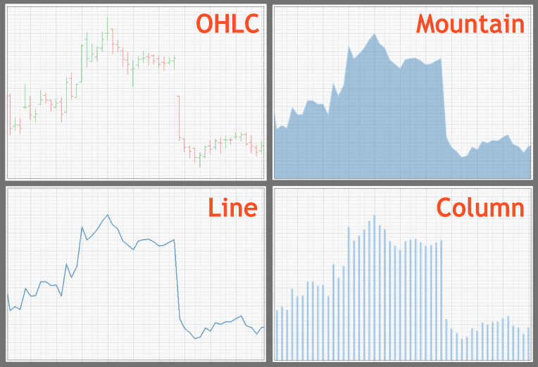
2. To change how the price data are displayed, go to the “Chart Type” dropdown on top.
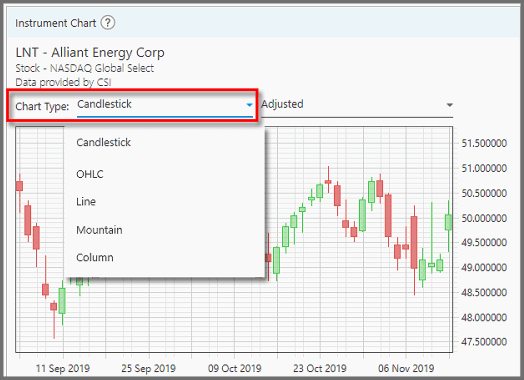
Here you can choose between:
- Candlestick (shows Open, High, Low, and Close prices, as well as bearish or bullish colors),
- OHLC, or Open High Low Close bar-chart (similar to Candlestick but more intuitive for seeing where the opening & closing prices are),
- Line (a line connecting the days' closing prices),
- Mountain (similar to Line but shaded), and
- Column (individual bars showing the closing prices).
3. At the top-right corner, you can choose to view the price in either the Adjusted value, or the Real value. “Adjusted” means the instrument's price is adjusted for stock-splits, new offering, dividend payments, etc. It is the most accurate representation of the price.
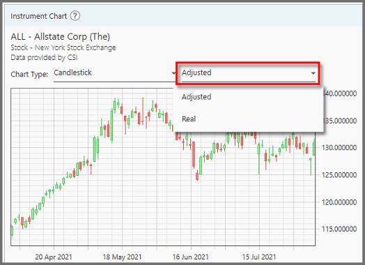
“Real” shows the real, historic price that instrument was traded. But without context, this raw price is misleading. Stock-splits, for example, may halve the price per share, but shareholders get two for every share they own. Ditto dividend effects (the drop in price during ex-dividend, and the fact you got the cash) are all affecting the final “value” of a stock, that can't be shown with the raw price.
4. The bottom chart is the Volume Chart. It shows the amount of shares traded day-by-day.
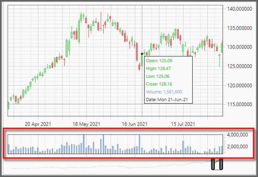
5. At the very bottom of this panel, there's a scroll-bar that you can drag to pan around the chart. Shrinking or expanding this scroll-bar (by dragging its ends) is the same as zooming-in or out.
You can see a general overview of the price history overlaid on this scroll-bar (conforming to the price chart above).
Note:
This panel will not show any contents if the instrument's price data is being downloaded.
Discount Applied Successfully!
Your savings have been added to the cart.
Report
Block Member?
Please confirm you want to block this member.
You will no longer be able to:
- See blocked member's posts
- Mention this member in posts
- Invite this member to groups
- Message this member
- Add this member as a connection
Please note: This action will also remove this member from your connections and send a report to the site admin. Please allow a few minutes for this process to complete.
Report